Method
How the number is built.
Published in full, because a figure you cannot audit is a figure you should not act on. Everything below is what runs against your data, in the order it runs.
Published in full, because a figure you cannot audit is a figure you should not act on. Everything below is what runs against your data, in the order it runs.
We work in thirty-minute intervals. For each interval we compute offered load in Erlangs from the calls that arrived and how long calls take to handle, and compare it against the agents actually available, adjusted for breaks and absence.
Erlang C assumes callers wait forever. They do not, which is why it overstates service and understates loss. Where your data supports it we use Erlang A and fit mean caller patience empirically: we regress your observed abandonment against modeled answer speed and solve for the patience parameter that explains it.
Fitting patience from your callers rather than importing an industry constant is the single strongest methodological difference between this and a spreadsheet. We report the fitted value and its confidence interval in the appendix. If the fit is poor, we say so and widen the reported range rather than quietly proceeding.
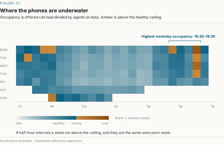
All figures on this page are illustrative, generated from a modelled reference
operation by dialworth/scripts/site_figures.py.
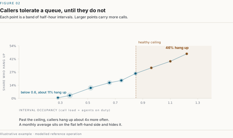
The loss itself:
Recovered is the most dangerous number in the whole model. If you have caller ID on your call records we measure it directly, by matching abandoned numbers against subsequent inbound calls within seventy-two hours. If you do not, we assume a conservative default and flag it. A higher recovery rate makes the headline figure smaller, so the default is chosen to understate.
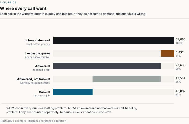
We benchmark against your own best performer, not an external ideal. Your best rep already controls for your market, your pricing, your lead sources and your season in a way no industry figure can.
Three controls apply before that number is credible:
Recruiting, interviewing and training are invoiced, so every owner already counts them. The ramp-period booking shortfall is not invoiced, so almost nobody does.
The ramp shortfall typically runs several times the recruiting cost. That asymmetry is usually the most actionable finding in the report, because it changes what retention is worth.
The three components overlap, and a report that sums them is overstating. Two controls are explicit:
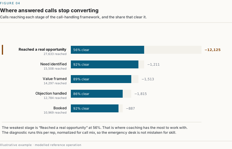
The report shows a reconciliation waterfall: total inbound demand, through answered, through booked, into the three buckets. If the buckets do not close against the gap, the analysis is wrong and does not ship.
We run ten thousand Monte Carlo draws over the assumptions that carry real uncertainty: recovery rate, attainability, fitted patience, job value sampled from your own distribution rather than its mean, the ramp curve, and contribution margin. You get a tenth, fiftieth and ninetieth percentile.
You also get a tornado chart ranking the assumptions by how much each contributes to the spread. That tells you which assumption is worth going and measuring properly, and it tells you where the model is weakest. Both are things a vendor selling certainty would rather you did not see.
Seven checks run before anything is computed. If one fails you receive a readiness report instead of a figure. There is no partial-result path.
Two further conditions do not block but widen the reported range: a single-season window, and one lead source dominating the mix.
A readiness report is a useful document in its own right. It tells you exactly what to turn on, and most of it is configuration you already own.
It will not say a change will increase bookings, or that a figure was caused by a practice. The engine measures association and models counterfactuals under stated assumptions, and the language stays inside what the method supports: modeled, associated with, under these assumptions.
Every parameter appears in the appendix with its source: measured from your data, stated by you, or an industry default. Defaults are flagged and counted on a limitations page that also lists what we could not measure and why. That page tends to build more credibility than any other in the document.
Six figures you already know gives you a screening range in about a minute. The full diagnostic prices it from your own call records in two to three weeks, for a fixed $4,500, and costs you about an hour of someone's time to pull the exports.
If your data cannot support a defensible figure, you get a readiness report naming exactly what to start capturing, at no charge, and no number is published.