Definitions
How the DialWorth Score is calculated
The whole rubric, published. The score is defensible because the formula is citable, not because a proprietary dataset sits behind it. You can recompute your own score by hand from this page.
The whole rubric, published. The score is defensible because the formula is citable, not because a proprietary dataset sits behind it. You can recompute your own score by hand from this page.
It is a deterministic index of phone-operation health, computed from figures you type in. Same inputs, same score, every time, for everyone. No dataset is consulted to produce the number itself.
It is not a measurement. It is built from self-reported figures, and self-reported figures are optimistic. The diagnostic replaces every one of them with a number pulled from your phone system and your field-service software, and the measured score is routinely different from the typed one. We would rather say that here than have you discover it later.
It is not our client benchmark. Those are two separate populations and we never pool them. Client benchmarks come from measured engagement data under explicit consent; this score comes from a public form. Mixing the two would quietly corrupt the more valuable one.
Our engine models three loss channels: capacity, conversion and turnover. The score takes one observable rate from each, so a five-CSR shop and a fifty-CSR shop are directly comparable. The score moves on how well the phone is run, never on how big the business is.
| Answer rate: 100 % minus your missed-call share | 35 |
| Booking rate: share of answered calls that become a booking | 45 |
| CSR retention: separations per CSR seat per year | 20 |
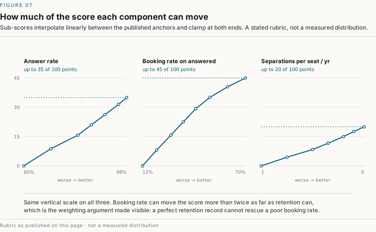
Booking rate carries the most weight because it applies to every answered call, while the capacity term applies only to the abandoned tail. At any realistic call volume, a point of booking rate is worth more than a point of answer rate.
Retention carries the least because it is the noisiest self-reported figure of the three and the slowest to move. It is in the score at all because leaving it out would let an operation score well while burning through staff, the condition that reliably produces the worst measured results two quarters later.
Average job value, contribution margin and call volume are deliberately excluded. They drive the dollar figure on the estimator, but they say nothing about how well the phone is answered. Including them would let a high-ticket business outscore a better-run low-ticket one, which is precisely the comparison this score exists to prevent.
Sub-scores interpolate linearly between the anchors below and clamp at both ends. These are a stated rubric, not a measured distribution. They encode our view of what good looks like, and we would rather argue about them in public than hide them.
| 98 % or better | 100 |
| 95 % | 90 |
| 90 % | 75 |
| 85 % | 60 |
| 80 % | 45 |
| 70 % | 25 |
| 60 % or worse | 0 |
| 70 % or better | 100 |
| 60 % | 90 |
| 50 % | 78 |
| 42 % | 65 |
| 35 % | 50 |
| 28 % | 35 |
| 20 % | 18 |
| 12 % or worse | 0 |
| 0 | 100 |
| 0.10 | 88 |
| 0.20 | 75 |
| 0.35 | 58 |
| 0.50 | 42 |
| 0.75 | 22 |
| 1.00 or worse | 0 |
| 90–100 | A+ · Exceptional |
| 80–89 | A · Strong |
| 70–79 | B · Solid |
| 60–69 | C · Middle of the pack |
| 45–59 | D · Material opportunity |
| Below 45 | Significant opportunity |
No score is labelled bad, failing or poor, here or anywhere else we publish. Below the midpoint we report the population median alongside your number and treat the gap as an opportunity to investigate, because that is what it is. A benchmark that exists to embarrass the people in it is not a benchmark, it is a stunt.
The score is computed on your device. The percentile is a rank against other people who have taken it, and it obeys two floors (the same floors our engine applies to paying clients):
Until the floors are met the card tells you where the benchmark stands instead: how many operations in your trade have been scored, and how many more are needed before trade ranking opens. That is the honest thing to display, and it has the useful side effect of telling you exactly how to make it publish sooner.
Written down now, while it is cheap to be honest about:
First review at 100 responses. We will publish what it says either way.